

Value progress chart
The value progress chart component is a generic component to inspect the progress of all sorts of data over time. It can be used in many different ways but requires some understanding to use effectively.
Time is divided in a number of periods, like months, weeks, days, or sessions. The shots for each period are placed in a different buckets. Next, for shots in each bucket a value is computed based on a formula you provide. And finally, these values for a bucket are combined into a single value by e.g. taking the average, or the sum.
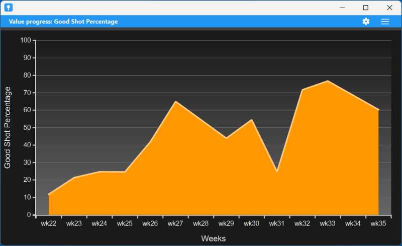
Let us look at some examples. Say, you define a good shot as a shot with a distance larger than 150 yards. You can use as a formula 1 if TotalDistance > 150 else 0. So the value is 1 for good shots and 0 otherwise. Now combine the values using the sum. Then the displayed value for each time period is the number of good shots in that period. If you are instead interested in the percentage of good shots, as a formula use 100 if TotalDistance > 150 else 0 and combine them by taking the average. If you want the number of sessions in each period, as formula use SessionId and combine that by using the Uniques operator that returns the number of unique values.
The chart has a menu in the right of the title bar. Here you have the following options:
- Save as PNG image. Save an image of the chart in a PNG file.
- Change settings. Change the settings. See below.
- Pop-out. Pop-out the chart as a separate window.
Settings
The value progress chart component has a large number of settings that you can change by clicking the settings icon in the title bar.
- General
- Name. The name of the component.
- Title. The title shown in the title bar. When you leave this empty, the metric name is shown in the title bar.
- Group by. To see progress the shots are grouped in buckets. Default each vertical position in the chart represents the shots during a particular week. But you can also use other bucket size. You can choose between sessions, days, weeks, months, and years.
- Value name. The name of the value you computed. This will be shown in the y-axis of the chart.
- Shot formula. The formula to use to compute the values for the shots. For more information see the help on formulas.
- Value to show. Here you can select what value you want to show in the chart, that is, how to combine the values for the different shots. You have a number of options. Default the average value for the values is shown. You can also show the minimum, maximum, range (that is max minus min), median (the middle value) and percentiles. The latter depends on the percentile setting. When you have a percentile of, say 25, percentile low will show the value of the metric that lies at 25%. Percentile high will show you the value at 75%. Finally you can select Total (the total number of shots), Sum (the sum of the values), and Uniques (the number of different values).
- Percentile. The percentile used in the chart when choosing a percentile value.
- Precision. The precision with which the values are shown, that is, the number of digits behind the dot.
- none. No curve is shown.
- regression line. This shows a line that best fits the values. It shows in a very global way whether the value is increasing or decreasing over time.
- regression curve. In this case a curve is fit through the values. This uses so-called quadratic polynomial regression.
- rolling average. This takes averages of 20% of the values and shows how that changes over time. (This cannot be shown for the first and last 10% of the values.)Fit curve. To get better insight in the progress, you can fit a curve through the values. You have the following possibilities:
- Data. Here you can define a filter in the form of a formula. Only shots that satisfy the filter are taken into account in the chart.
- Appearance
- Style. Here you can set the style of the chart. Default is the Area style. You can also select a simple line or vertical bars.
- Use wide bars. Check this if in the bars style you prefer wider bars that touch each other.
- Use alternating colors. If checked, in the bars style bars will use alternating colors. Otherwise they all use the same color.
- Show the values. When checked the values are shown in the chart.
- For other appearance settings, see the help on charts.
Note that there are buttons to reset the settings to the default (as defined in the dashboard) and to copy the settings from another value progress chart component.